Re: [keycloak-dev] Logo ideas

Nice!
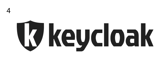
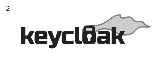
My favourites are especially 1 and 3.
Marek
On 7.1.2014 21:57, Gabriel Cardoso wrote:
Hi,
based on the concept of security and the "key" and "cloak" elements,
I
worked on some initial ideas for the logo.
After we choose one or two ideas, I'll refine the symbol, the font and
put colours.
*Which proposal do you think is more interesting for the project? *
Thanks,
Gabriel
01: I hope to have better background light effects for the final version
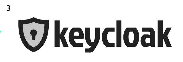
02: Will work more on the flying cloak
03: Maybe too ordinary
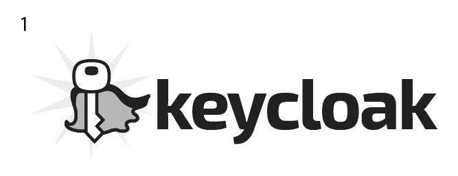
04: Will work more on the "K" in the shield
_______________________________________________
keycloak-dev mailing list
keycloak-dev(a)lists.jboss.org
https://lists.jboss.org/mailman/listinfo/keycloak-dev
Attachments:
- attachment.png (image/png — 16.3 KB)
- attachment.png (image/png — 17.3 KB)
- attachment.png (image/png — 17.6 KB)
- 01.png (image/png — 23.1 KB)
- attachment.html (text/html — 3.0 KB)