Re: [keycloak-dev] Logo ideas

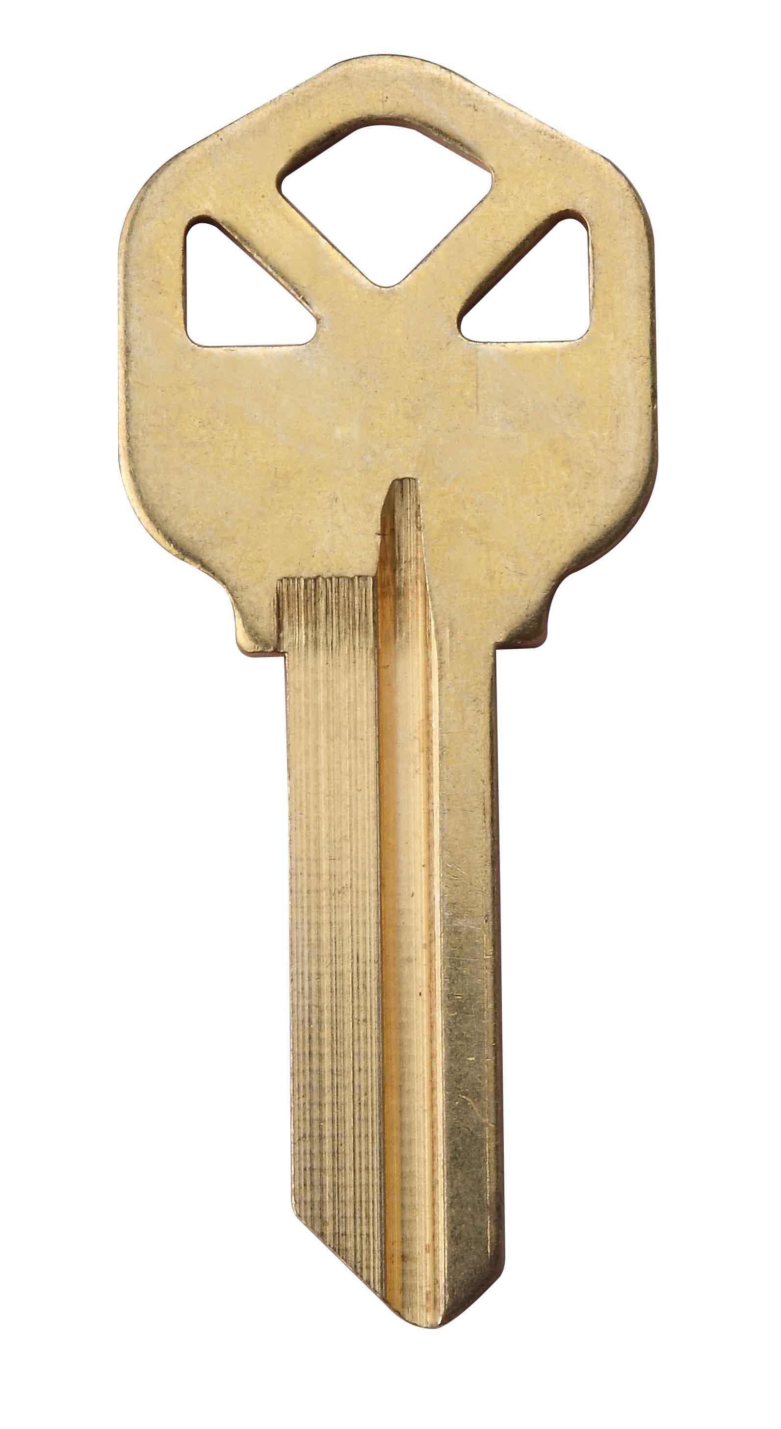
I like the super hero best (#1).
With a little change to the key design, you could make it look like he
has a face. Some variation on this key might work:
http://image2.cccme.org.cn/i_supply/2010/4/5/201101030953243219_123622924...
On 1/7/2014 3:57 PM, Gabriel Cardoso wrote:
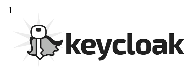
Hi,
based on the concept of security and the "key" and "cloak" elements,
I
worked on some initial ideas for the logo.
After we choose one or two ideas, I'll refine the symbol, the font and
put colours.
*Which proposal do you think is more interesting for the project? *
Thanks,
Gabriel
01: I hope to have better background light effects for the final version
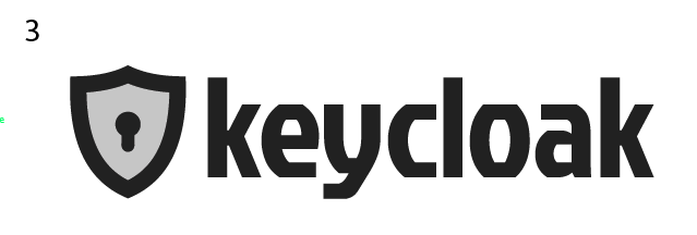
02: Will work more on the flying cloak
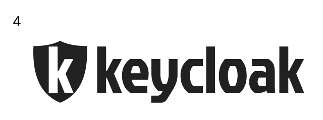
03: Maybe too ordinary
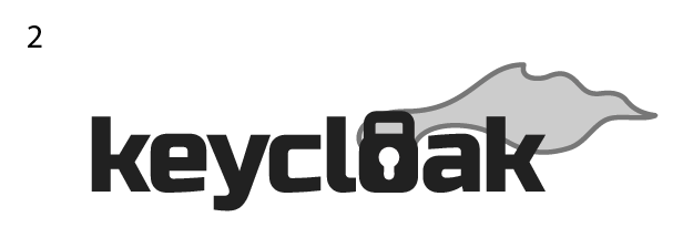
04: Will work more on the "K" in the shield
_______________________________________________
keycloak-dev mailing list
keycloak-dev(a)lists.jboss.org
https://lists.jboss.org/mailman/listinfo/keycloak-dev
Attachments:
- attachment.png (image/png — 16.3 KB)
- attachment.png (image/png — 17.3 KB)
- attachment.png (image/png — 17.6 KB)
- 01.png (image/png — 23.1 KB)
- attachment.html (text/html — 3.3 KB)