[keycloak-dev] Logo ideas

Hi,
based on the concept of security and the “key” and “cloak” elements, I worked on some
initial ideas for the logo.
After we choose one or two ideas, I’ll refine the symbol, the font and put colours.
Which proposal do you think is more interesting for the project?
Thanks,
Gabriel
01: I hope to have better background light effects for the final version
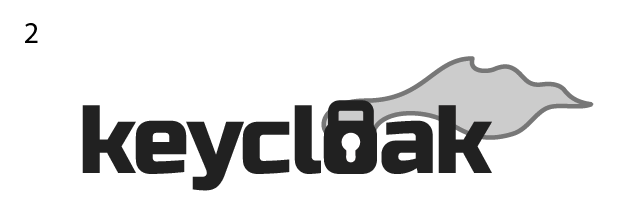
02: Will work more on the flying cloak
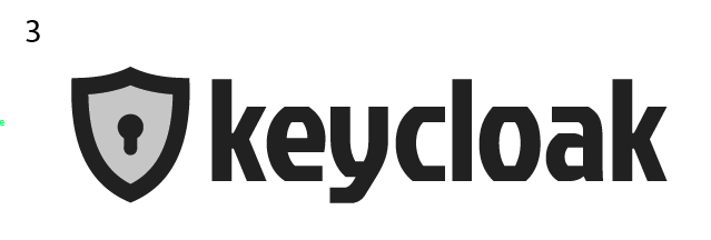
03: Maybe too ordinary
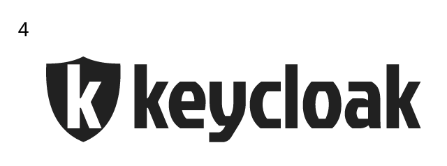
04: Will work more on the “K” in the shield
Attachments:
- 04.png (image/png — 16.3 KB)
- 03.png (image/png — 17.3 KB)
- 02.png (image/png — 17.6 KB)
- 01.png (image/png — 23.1 KB)
- attachment.html (text/html — 1.7 KB)