[keycloak-dev] Proposed changes to menu

When writing documentation to using the admin console I realised the menus are confusing.
Most applications/websites have their main-menu at the top, with a sub-menu on the left
(or right).
Also I don't think there's any benefit to the breadcrumbs as we never navigate
deep enough for it to be useful.
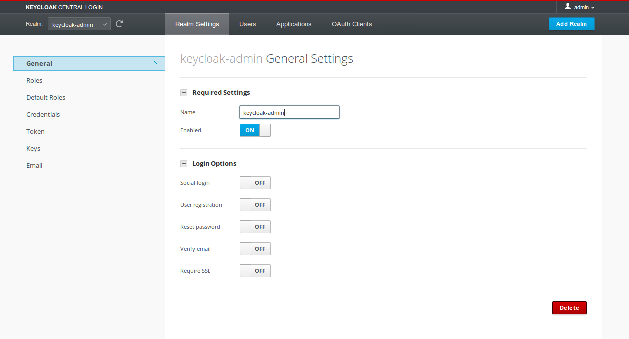
I propose that we move the items from the menu to the left into the same menu as the realm
selector. Then we move the sub-menu items into the left menu. And also remove the
breadcrumb. See attached screenshot for how this would look like.
I think this is a significant improvement, and it would be worth to get this into the
alpha1 IMO. I can have this tested and committed today if there's consent for it!
Attachments:
- menu-proposal.png (image/png — 44.0 KB)