
9:02 a.m.
When writing documentation to using the admin console I realised the menus are confusing.
Most applications/websites have their main-menu at the top, with a sub-menu on the left
(or right).
Also I don't think there's any benefit to the breadcrumbs as we never navigate
deep enough for it to be useful.
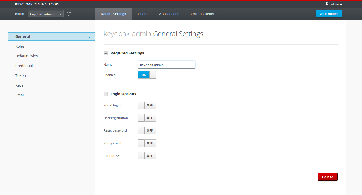
I propose that we move the items from the menu to the left into the same menu as the realm
selector. Then we move the sub-menu items into the left menu. And also remove the
breadcrumb. See attached screenshot for how this would look like.
I think this is a significant improvement, and it would be worth to get this into the
alpha1 IMO. I can have this tested and committed today if there's consent for it!

9:37 a.m.
Looks better and it's less confusing. Even if there will be any
objections from professional point of view (gabriel:) this is still
better than the current state.
On Tue, 2014-01-21 at 10:02 -0500, Stian Thorgersen wrote:
When writing documentation to using the admin console I realised the
menus are confusing.
Most applications/websites have their main-menu at the top, with a sub-menu on the left
(or right).
Also I don't think there's any benefit to the breadcrumbs as we never navigate
deep enough for it to be useful.
I propose that we move the items from the menu to the left into the same menu as the
realm selector. Then we move the sub-menu items into the left menu. And also remove the
breadcrumb. See attached screenshot for how this would look like.
I think this is a significant improvement, and it would be worth to get this into the
alpha1 IMO. I can have this tested and committed today if there's consent for it!
_______________________________________________
keycloak-dev mailing list
keycloak-dev(a)lists.jboss.org
https://lists.jboss.org/mailman/listinfo/keycloak-dev

9:47 a.m.
#1, I've used and like the breadcrumbs.
#2, I don't think this is as significant as you claim. This is
completely an aesthetic change. It doesn't reduce any clicks. At least
as compared to Wildfly/JBoss console, *most* of interesting menu items
are on the left side.
#3, We may run out of room on the top menu as we may be adding things
like "devices" and "servers". Not everybody has 1900x1200 displays
and
the admin UI already bearly fits in 1024x800 screencasts.
#4, This change wastes a week of work I did on screencasts for minimal
gain. I'm going to be seriously pissed if I have to redo these before
Thursday...
So, -1 and no vote for me at least for Alpha 1.
On 1/21/2014 10:02 AM, Stian Thorgersen wrote:
When writing documentation to using the admin console I realised the
menus are confusing.
Most applications/websites have their main-menu at the top, with a sub-menu on the left
(or right).
Also I don't think there's any benefit to the breadcrumbs as we never navigate
deep enough for it to be useful.
I propose that we move the items from the menu to the left into the same menu as the
realm selector. Then we move the sub-menu items into the left menu. And also remove the
breadcrumb. See attached screenshot for how this would look like.
I think this is a significant improvement, and it would be worth to get this into the
alpha1 IMO. I can have this tested and committed today if there's consent for it!
_______________________________________________
keycloak-dev mailing list
keycloak-dev(a)lists.jboss.org
https://lists.jboss.org/mailman/listinfo/keycloak-dev
--
Bill Burke
JBoss, a division of Red Hat
http://bill.burkecentral.com
9:59 a.m.
I think "most applications/websites have their main menu at the top" is
a stianism. cloud.google.com has their menu on the left. gmail has
their menu both on the left and top. Github has their menus on right.
Wordpress has their console menus on the left.
.
So I'd say that most applications/websites have completely different
ways of organizing their menus and I find this change does nothing for
me other than waste a week of work I did.
On 1/21/2014 10:47 AM, Bill Burke wrote:
#1, I've used and like the breadcrumbs.
#2, I don't think this is as significant as you claim. This is
completely an aesthetic change. It doesn't reduce any clicks. At least
as compared to Wildfly/JBoss console, *most* of interesting menu items
are on the left side.
#3, We may run out of room on the top menu as we may be adding things
like "devices" and "servers". Not everybody has 1900x1200 displays
and
the admin UI already bearly fits in 1024x800 screencasts.
#4, This change wastes a week of work I did on screencasts for minimal
gain. I'm going to be seriously pissed if I have to redo these before
Thursday...
So, -1 and no vote for me at least for Alpha 1.
On 1/21/2014 10:02 AM, Stian Thorgersen wrote:
> When writing documentation to using the admin console I realised the menus are
confusing.
>
> Most applications/websites have their main-menu at the top, with a sub-menu on the
left (or right).
>
> Also I don't think there's any benefit to the breadcrumbs as we never
navigate deep enough for it to be useful.
>
> I propose that we move the items from the menu to the left into the same menu as the
realm selector. Then we move the sub-menu items into the left menu. And also remove the
breadcrumb. See attached screenshot for how this would look like.
>
> I think this is a significant improvement, and it would be worth to get this into the
alpha1 IMO. I can have this tested and committed today if there's consent for it!
>
>
>
> _______________________________________________
> keycloak-dev mailing list
> keycloak-dev(a)lists.jboss.org
> https://lists.jboss.org/mailman/listinfo/keycloak-dev
>
--
Bill Burke
JBoss, a division of Red Hat
http://bill.burkecentral.com
10:27 a.m.
I hadn't considered the screencasts, and it does result in this having a much bigger
impact than I'd considered. So it's definitively not something to do now, probably
not in the future either.
Just to clarify, I was considering sites that have a main and a sub navigation menu. So
for those sites you've listed:
* cloud.google.com - has a single navigation menu, so it can be on the left that's
fine
* gmail - has a single navigation menu, the bit above lists/mails are tools for the
particular view
* github - has two navigation menus, the main (explore, gist, blog) is at the top, while
the sub is at the right (code, pr, etc..) / github is horrible though, I always have to
search around to find things
* wordpress - can't comment as I don't use it
It goes to reason that a user scans a page from top to bottom, and in a LTR language from
left to right. Hence the menus should be placed according to scan-order. Talking about
screen estate this would save 90px in vertical height, which is around 10% on most
displays, but I appreciate that horizontal scaling is acceptable.
----- Original Message -----
From: "Bill Burke" <bburke(a)redhat.com>
To: keycloak-dev(a)lists.jboss.org
Sent: Tuesday, 21 January, 2014 3:59:44 PM
Subject: Re: [keycloak-dev] Proposed changes to menu
I think "most applications/websites have their main menu at the top" is
a stianism. cloud.google.com has their menu on the left. gmail has
their menu both on the left and top. Github has their menus on right.
Wordpress has their console menus on the left.
.
So I'd say that most applications/websites have completely different
ways of organizing their menus and I find this change does nothing for
me other than waste a week of work I did.
On 1/21/2014 10:47 AM, Bill Burke wrote:
> #1, I've used and like the breadcrumbs.
> #2, I don't think this is as significant as you claim. This is
> completely an aesthetic change. It doesn't reduce any clicks. At least
> as compared to Wildfly/JBoss console, *most* of interesting menu items
> are on the left side.
> #3, We may run out of room on the top menu as we may be adding things
> like "devices" and "servers". Not everybody has 1900x1200
displays and
> the admin UI already bearly fits in 1024x800 screencasts.
> #4, This change wastes a week of work I did on screencasts for minimal
> gain. I'm going to be seriously pissed if I have to redo these before
> Thursday...
>
> So, -1 and no vote for me at least for Alpha 1.
>
> On 1/21/2014 10:02 AM, Stian Thorgersen wrote:
>> When writing documentation to using the admin console I realised the menus
>> are confusing.
>>
>> Most applications/websites have their main-menu at the top, with a
>> sub-menu on the left (or right).
>>
>> Also I don't think there's any benefit to the breadcrumbs as we never
>> navigate deep enough for it to be useful.
>>
>> I propose that we move the items from the menu to the left into the same
>> menu as the realm selector. Then we move the sub-menu items into the left
>> menu. And also remove the breadcrumb. See attached screenshot for how
>> this would look like.
>>
>> I think this is a significant improvement, and it would be worth to get
>> this into the alpha1 IMO. I can have this tested and committed today if
>> there's consent for it!
>>
>>
>>
>> _______________________________________________
>> keycloak-dev mailing list
>> keycloak-dev(a)lists.jboss.org
>> https://lists.jboss.org/mailman/listinfo/keycloak-dev
>>
>
--
Bill Burke
JBoss, a division of Red Hat
http://bill.burkecentral.com
_______________________________________________
keycloak-dev mailing list
keycloak-dev(a)lists.jboss.org
https://lists.jboss.org/mailman/listinfo/keycloak-dev
11:20 a.m.
On 1/21/2014 11:27 AM, Stian Thorgersen wrote:
I hadn't considered the screencasts, and it does result in this
having a much bigger impact than I'd considered. So it's definitively not
something to do now, probably not in the future either.
I'm just being whiny and lazy and trying to find some lame reasons not
to have to redo the screencasts, but I really don't want to delay
another week. If our current UI is inconsistent with Wildfly/JBoss
admin console, we should probably change it. I'd really like Gabriel to
comment though...
(BTW, I agree github is horrible...I can never figure out where things
are and always forget).
--
Bill Burke
JBoss, a division of Red Hat
http://bill.burkecentral.com
11:37 a.m.
----- Original Message -----
From: "Bill Burke" <bburke(a)redhat.com>
To: "Stian Thorgersen" <stian(a)redhat.com>
Cc: keycloak-dev(a)lists.jboss.org
Sent: Tuesday, 21 January, 2014 5:20:08 PM
Subject: Re: [keycloak-dev] Proposed changes to menu
On 1/21/2014 11:27 AM, Stian Thorgersen wrote:
> I hadn't considered the screencasts, and it does result in this having a
> much bigger impact than I'd considered. So it's definitively not something
> to do now, probably not in the future either.
>
I'm just being whiny and lazy and trying to find some lame reasons not
to have to redo the screencasts, but I really don't want to delay
another week. If our current UI is inconsistent with Wildfly/JBoss
admin console, we should probably change it. I'd really like Gabriel to
comment though...
Nah - it's a fair comment. Delaying for this is not a good idea, and redoing a bunch
of screencasts is very time consuming. With that in mind I wouldn't have proposed this
change.
Overall I think the usability of the admin console is really good. There probably could be
improvements, but we shouldn't do anything without feedback from real users.
(BTW, I agree github is horrible...I can never figure out where things
are and always forget).
--
Bill Burke
JBoss, a division of Red Hat
http://bill.burkecentral.com

1:41 p.m.
Hi guys,
I guess the way the navigation is structured right now is a side effect of my original
design proposal, where we had a top level of navigation with “Overview”, “Applications”
and “Realms”. I probably just replaced the top nav by the dropdown and honestly I did not
consider putting the sidebar at the top.
I consider Stian’s change interesting since it optimizes the vertical space and removes
one level of navigation. Usability wise, it is hard to say, probably better for the firsts
accesses but with no gain after a couple of usages (since the user will get familiar with
the navigation).
I don't consider the removal of the breadcrumb something good since some people use it
(Bill and I, at least) and it might reveal some level of navigation that is not displayed
in the menu (e.g. My realm > Applications > My application > Roles). In this
case, My application was not visible on the menus, so it helps the user to know where he
is.
I know that we won’t do anything now, but I just wanted to express my point of view ;)
Gabriel
On Jan 21, 2014, at 3:37 PM, Stian Thorgersen <stian(a)redhat.com> wrote:
----- Original Message -----
> From: "Bill Burke" <bburke(a)redhat.com>
> To: "Stian Thorgersen" <stian(a)redhat.com>
> Cc: keycloak-dev(a)lists.jboss.org
> Sent: Tuesday, 21 January, 2014 5:20:08 PM
> Subject: Re: [keycloak-dev] Proposed changes to menu
>
>
>
> On 1/21/2014 11:27 AM, Stian Thorgersen wrote:
>> I hadn't considered the screencasts, and it does result in this having a
>> much bigger impact than I'd considered. So it's definitively not
something
>> to do now, probably not in the future either.
>>
>
> I'm just being whiny and lazy and trying to find some lame reasons not
> to have to redo the screencasts, but I really don't want to delay
> another week. If our current UI is inconsistent with Wildfly/JBoss
> admin console, we should probably change it. I'd really like Gabriel to
> comment though...
Nah - it's a fair comment. Delaying for this is not a good idea, and redoing a bunch
of screencasts is very time consuming. With that in mind I wouldn't have proposed this
change.
Overall I think the usability of the admin console is really good. There probably could
be improvements, but we shouldn't do anything without feedback from real users.
>
> (BTW, I agree github is horrible...I can never figure out where things
> are and always forget).
>
>
> --
> Bill Burke
> JBoss, a division of Red Hat
> http://bill.burkecentral.com
>
_______________________________________________
keycloak-dev mailing list
keycloak-dev(a)lists.jboss.org
https://lists.jboss.org/mailman/listinfo/keycloak-dev
---
Gabriel Cardoso
User Experience Designer @ Red Hat
4558
days inactive
4558
days old
7 comments
4 participants
participants (4)
-
 Bill Burke
 -
 Gabriel Cardoso
 -
 Stian Thorgersen
 -
 Viliam Rockai